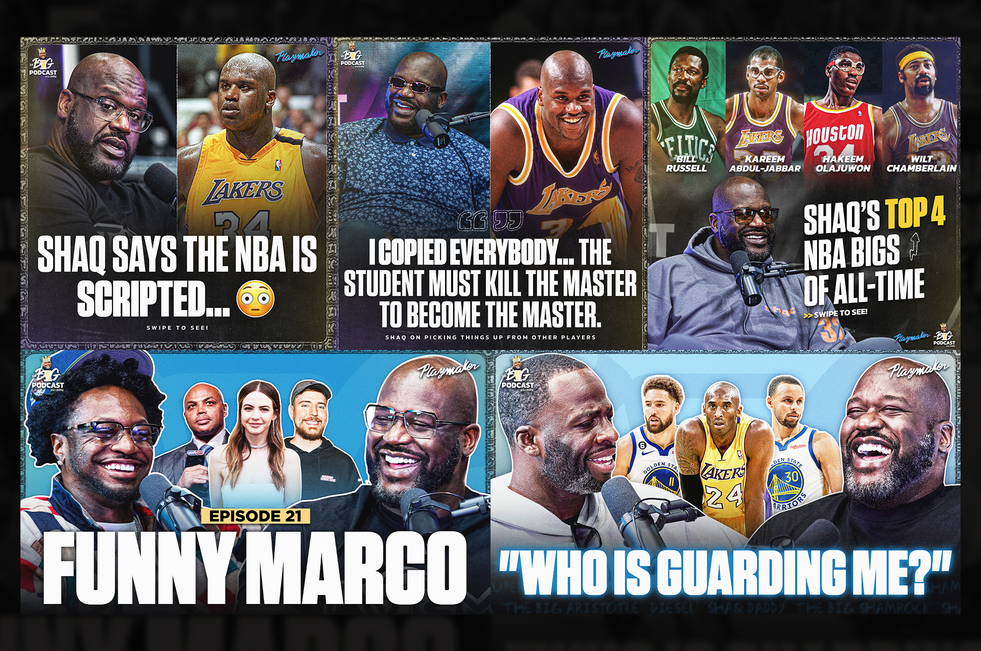
Season 1 branding
Season 1 established the initial visual direction for The Big Podcast. I helped create and refine the early graphic style, which had a more grungy, textured look. While the approach eventually shifted in later seasons, this first iteration set the foundation for how the show expressed itself visually across social media. It represented the starting point that future rebrands would build on and evolve from.
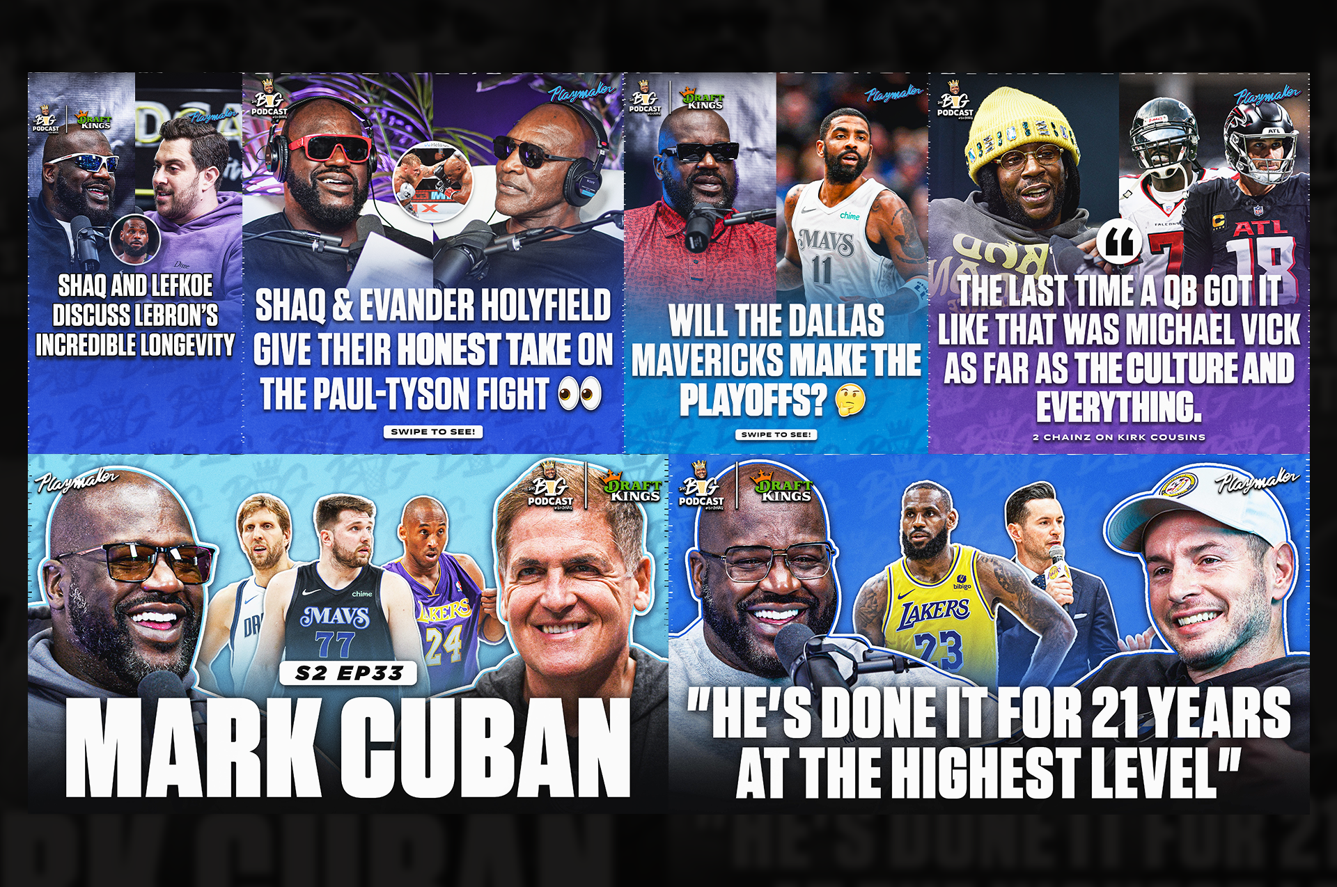
Season 2 branding
For Season 2, I helped lead a major visual shift for the show. We moved away from the darker, grungier look from Season 1 and pivoted into a brighter, more colorful style that felt more aligned with the energy and fun of the podcast. I contributed to developing the updated templates, color system, and overall identity that gave the show a cleaner, more modern presence on social.
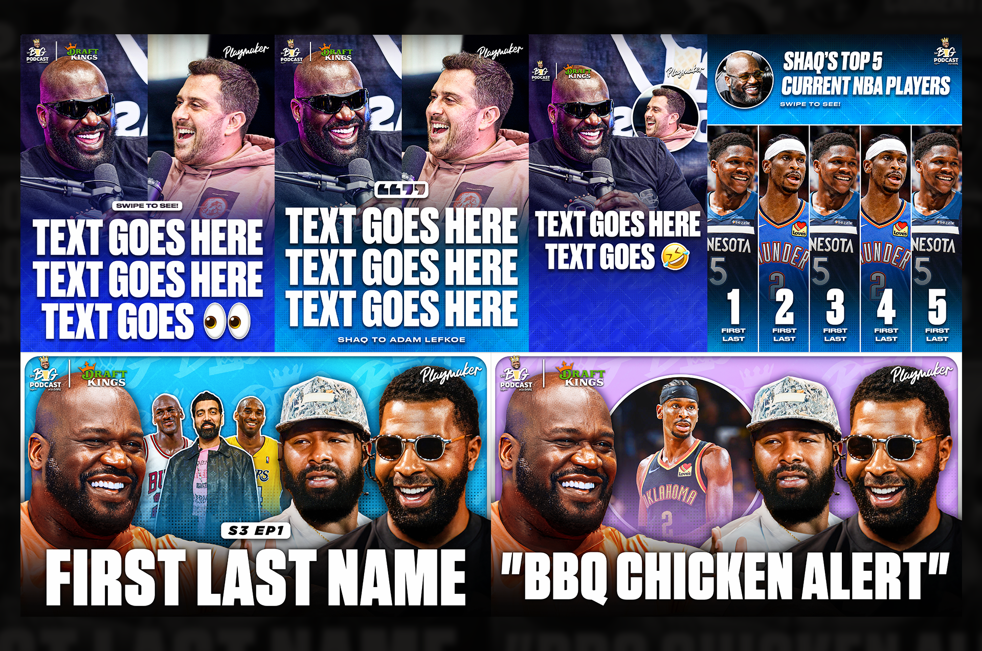
Season 3 branding
For Season 3, I shifted into more of an art-direction role. I helped guide the designers on our team through the refresh, ensuring the updated templates stayed true to the Season 2 identity while feeling cleaner and more polished for a new season. My involvement focused on creative direction, feedback, and consistency across all assets as the team executed the visuals.
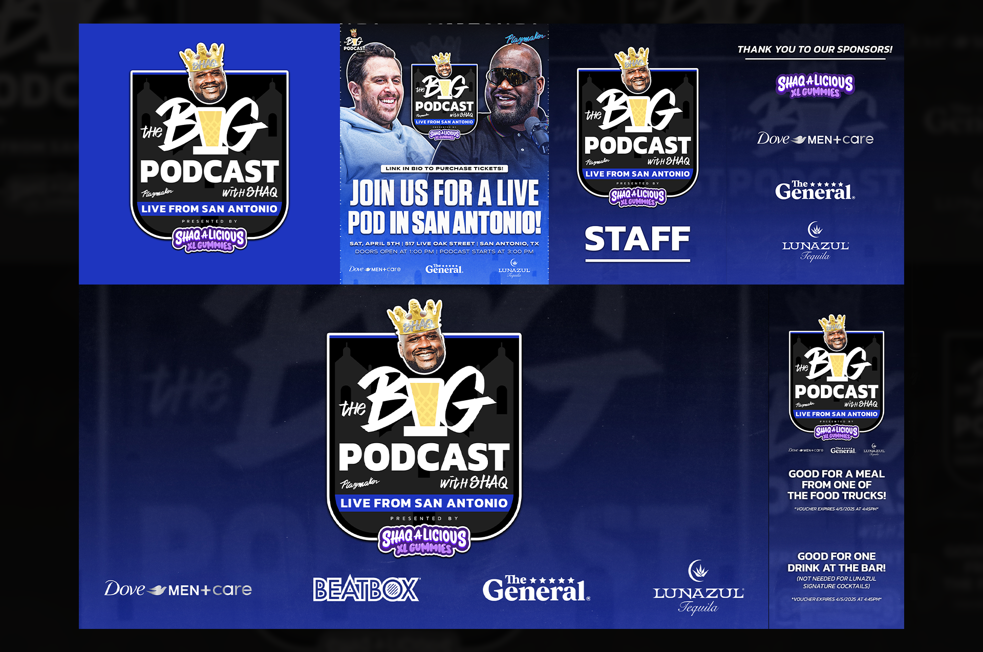
event materials
For The Big Podcast's live event in San Antonio, I created a full set of branded event materials. This included an event logo, credential passes, and promotional graphics for social media. The goal was to build a cohesive look that connected the live experience with the podcast’s existing brand identity. These assets helped bring the event to life visually and ensured everything felt polished and consistent.