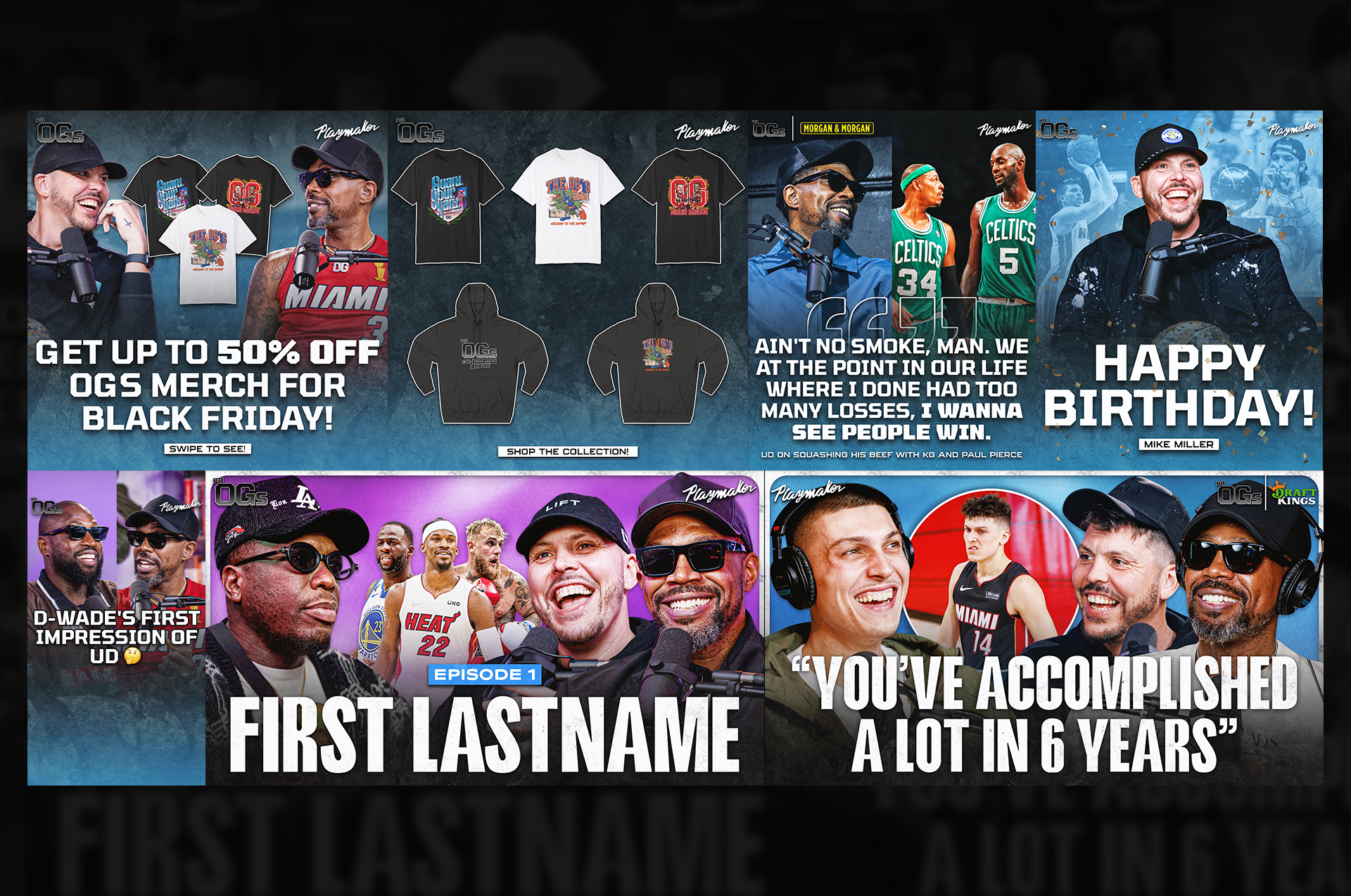
Season 1 branding
For the first season of The OGs, I created a visual style that leaned into a darker, more grungy look. The show has a raw, throwback energy, and the templates reflected that through textures and a rougher overall feel. This season set the foundation for how the show would look across social.
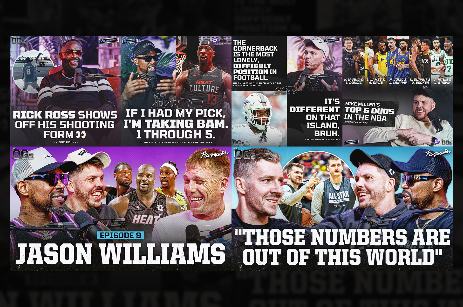
Season 2 branding
For season two, I updated the look by bringing in more color while still keeping some of the grunge textures from season one. The goal was to make the graphics feel a little brighter and more dynamic without losing the tone of the show. Season two basically built on what we had, just with a cleaner, more refreshed direction.