Season 1 branding
Season 1 set the tone for The Roommates brand. It has a fun and energetic feel that matches the friendship between Jalen Brunson and Josh Hart. The look used a strong red color palette, along with argyle patterns and the gold frame that became a staple throughout the show. Most of the initial templates were created by other designers on our team, and I helped refine, clean up, and guide the final versions so everything felt consistent.
Season 2 branding
For Season 2, we built on what was already established and shifted the primary color from red to blue. The goal was to refresh the visuals without losing the identity viewers recognized from Season 1. I led the creative direction and provided feedback on layout and consistency, while the templates themselves were a collaborative team effort.
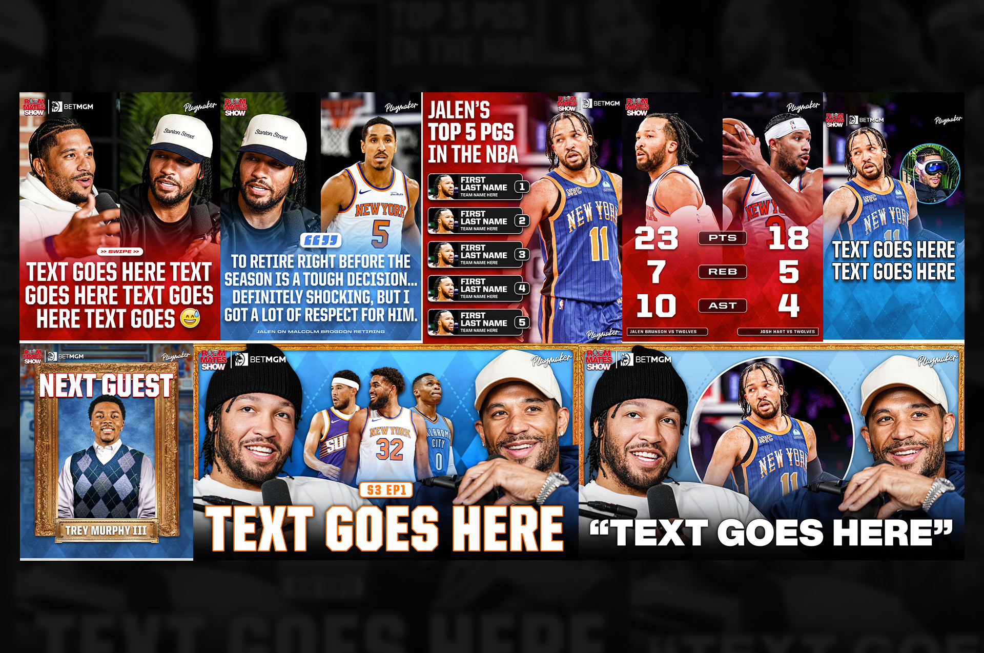
Season 3 branding
Season 3 brought another refresh that mixed red and blue together. This helped tie the previous seasons into a new look. We updated fonts, cleaned up layouts, and added some new elements to make the season feel fresh. My role focused on creative direction and approvals so that the final templates still felt like The Roommates but with an updated feel for a new season.
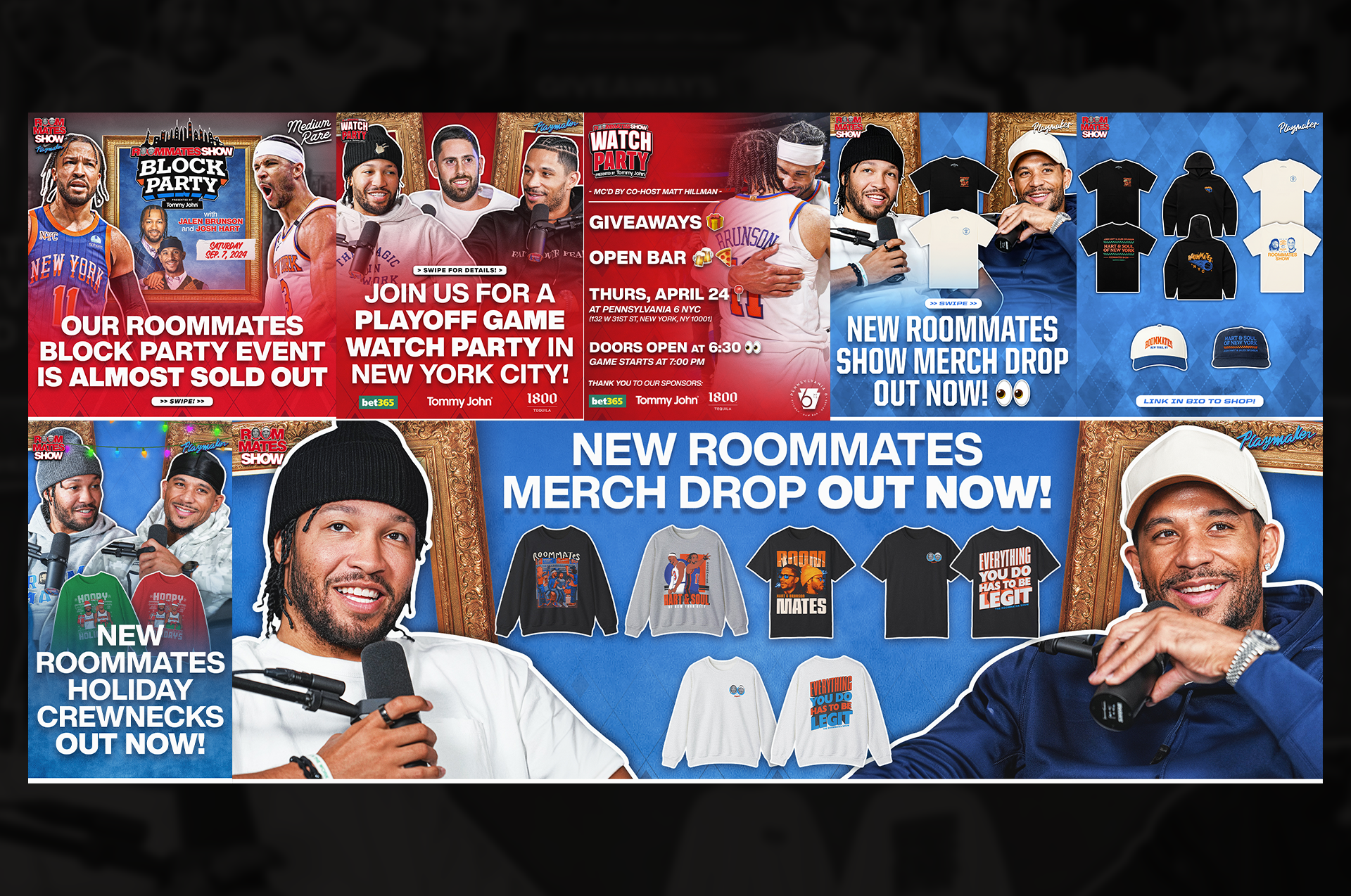
event materials
I created a range of promotional graphics to support Roommates events, watch parties, and merch drops. The focus was on keeping everything visually aligned with the show’s identity while making each asset clear and effective.